
本記事では、こちらの記事で作成した以下のPathwayスコア行列に基づいて、化合物をクラスタリングします。
| Pathway $1$ | Pathway $2$ | … | Pathway $j$ | … | Pathway $N_p$ | |
| 化合物 $1$ | $p_{11}$ | $p_{12}$ | … | $p_{1j}$ | … | $p_{1N_{p}}$ |
| 化合物 $2$ | $p_{21}$ | $p_{22}$ | … | $p_{2j}$ | … | $p_{2N_{p}}$ |
| … | … | … | … | … | … | … |
| 化合物 $i$ | $p_{i1}$ | $p_{i2}$ | … | $p_{ij}$ | … | $p_{iN_{p}}$ |
| … | … | … | … | … | … | … |
| 化合物 $N_c$ | $p_{N_{c}1}$ | $p_{N_{c}2}$ | … | $p_{N_{c}j}$ | … | $p_{N_{c}N_{p}}$ |
0. はじめに
本記事は、以下の記事の続きになります。

1. 化合物の標的タンパクを取得
以下の記事に従い、化合物のInChIKeyから標的タンパクのリスト(シンボル表記)を得る辞書(ink_syms)を作成します。
2. Pathwayを構成するタンパクを取得
以下の記事に従い、PathwayのIDからPathwayに含まれるのタンパクのリスト(シンボル表記)を得る辞書(ptm_syms)を作成します。

3. 標的Pathwayの算出
以下の記事に従い、冒頭の行列に相当するdf_scoreを用意します。

4. 次元削減
化合物の分布を2次元平面上に可視化するため、df_scoreを次元削減します。
4.1. 次元削減の関数を作成
本記事ではPCAとUMAPで次元削減をします。以下のように関数を定義しておきます。
# library
import pandas as pd
import numpy as np
import pickle
from sklearn.decomposition import PCA
from umap.umap_ import UMAP


# 乱数の固定
import random
import numpy as np
def fix_seeds(seed=0):
    random.seed(seed)
    np.random.seed(seed)

fix_seeds(42)


# 次元削減の関数
def decompsition(df, method): # index = 化合物, column = Pathway
  	# infとnanに対する前処理
    maxv = df.replace([np.inf], 0).max().max()
    df = df.replace([np.inf], maxv + 1).replace([-np.inf, np.nan], 0)

    if method == 'PCA':
        pca = PCA()
        pca.fit(df)
        data = pd.DataFrame(pca.transform(df))
        data.index = df.index
        data.columns = [f'col_{i}' for i in range(len(data.T))]
    elif method == 'UMAP':
        # data = pd.DataFrame(umap.UMAP().fit_transform(df))
        data = pd.DataFrame(UMAP().fit_transform(df))
        data.index = df.index
        data.columns = [f'col_{i}' for i in range(len(data.T))]
    else:
        return None

    return data
4.2. PCAおよびUMAPの実行
上記の関数を以下のように実施します。
# library & constants
import datetime
import pickle
import time
import os

TEMP_DIR = 'temp'
RES_DIR = 'results'


# 結果の保存先のディレクトリ名に用いるタイムスタンプ出力関数
def now():
    return str(datetime.datetime.now().strftime('%Y-%m-%d %H-%M-%S'))


# 結果を保存する関数
def pickle_save(path, data):
    with open(f'{path}', 'wb') as tf:
        pickle.dump(data, tf)


# ディレクトリ作成
no = now()
os.makedirs(f"{TEMP_DIR}/decomposition/{no}")


# PCA
res_pca = decompsition(df_score, 'PCA')
pickle_save(f"{TEMP_DIR}/decomposition/{no}/PCA.pkl", res_pca)


# UMAP
res_umap = decompsition(df_score, 'UMAP')
pickle_save(f"{TEMP_DIR}/decomposition/{no}/UMAP.pkl", res_umap)
4.3. PCAおよびUMAPの結果の可視化
PCAとUMAPの結果を可視化する関数を作成します。
# bokeh libraries
from bokeh.plotting import output_notebook, figure, show
from bokeh.io import save

# 可視化の関数
def plot_decomposition(res_decomposition, method, no, output='html'):
    # dataset definition
    df = res_decomposition.iloc[:, :2]
    df['InChIKey'] = df.index

    # hover definition
    tooltips=[
        ('InChIKey', '@InChIKey')
    ]

    # Plot
    p = figure(
        width = 750, height = 600, title=f'{method}',
        x_axis_label = 'Axis 1', y_axis_label = 'Axis 2', tooltips=tooltips
    )
    p.scatter(
        x = 'col_0', y = 'col_1',
        source = df,
        color = 'blue',
        size = 8, alpha = 0.2
    )

    # output
    if output == 'html':
        os.makedirs(f'{RES_DIR}/bokeh/decomposition/{no}', exist_ok=True)
        save(p, filename=f'{RES_DIR}/bokeh/decomposition/{no}/decompsition_{method}.html')
    elif output == 'notebook':
      	output_notebook()
        show(p)
    else: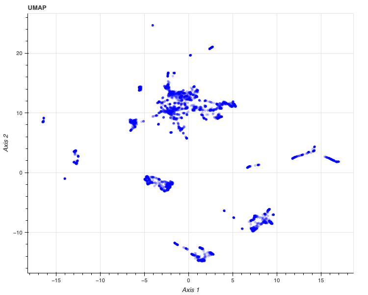
pass上記の関数plot_decompositionを用いて、PCAの結果(res_pca)は以下のように可視化できます。
no = now()
plot_decomposition(res_pca, 'PCA', no, 'notebook')

同様にUMAPの結果(res_umap)は以下のように可視化できます。
plot_decomposition(res_umap, 'UMAP', no, 'notebook')
5. クラスタリング
本記事では、混合ガウスモデル(Gaussian Mixture Model, GMM)によって前節の2次元データをモデリングします。
5.1. BICの計算
混合するガウス分布の数は最大50とし、BICが一番小さい数を選択します。
まずは以下の1から50の混合数および4種類の共分散の種類について、BICの計算を行います。
以下のように関数を定義して実行します。
# libraries
from sklearn import mixture
from sklearn.mixture import GaussianMixture


# GMMのBICを計算する関数
def calc_gmm_BICs(
    res_decomposition,
    n_component,
    cv_types = ['spherical', 'tied', 'diag', 'full'],
    reg_covar = 0.1
):
    # to nparray
    xy = np.array(res_decomposition.iloc[:, :2])

    # BIC
    BICs = []
    best_gmm = None
    lowest_bic = np.infty
    lowest_bic_cv_type = ""
    lowest_bic_n_component = 0
    n_components_range = range(1, n_component + 1)
    n_init = 10
    for cv_type in cv_types:
        for n_components in n_components_range:
            gmm = mixture.GaussianMixture(
                n_components = n_components,
                covariance_type = cv_type,
                n_init = n_init,
                reg_covar = reg_covar,
                random_state=42
            )
            gmm.fit(xy)
            BICs.append(gmm.bic(xy))
            if BICs[-1] < lowest_bic:
                lowest_bic = BICs[-1]
                best_gmm = gmm
                lowest_bic_cv_type = cv_type
                lowest_bic_n_component = n_components

    return {
        'best_gmm': best_gmm,
        'BICs': BICs,
        'lowest_bic': lowest_bic,
        'lowest_bic_cv_type': lowest_bic_cv_type,
        'lowest_bic_n_component': lowest_bic_n_component,
        'n_component': n_component,
        'cv_types': cv_types,
        'reg_covar': reg_covar
    }


# PCAとUMAPの各々についてBICを計算
bic_results_pca = calc_gmm_BICs(res_pca, 50)
bic_results_umap = calc_gmm_BICs(res_umap, 50)


# 結果の保存
no = now()
os.makedirs(f'{TEMP_DIR}/best_gmm/{no}')
pickle_save(f'{TEMP_DIR}/best_gmm/{no}/bic_dict_pca.pkl', bic_results_pca)
pickle_save(f'{TEMP_DIR}/best_gmm/{no}/bic_dict_umap.pkl', bic_results_umap)
5.2. BICに基づいたモデル選択 (クラスタリング)
次に、上記の結果を可視化し、混合するガウス分布の数を決めます。
可視化の関数は以下です。
# library
import itertools
# Plot the BIC scores
def plot_gmm_BICs(bic_results, cv_colors = ['blue', 'green', 'red', 'orange']):
# unpacking
BICs = np.array(bic_results['BICs'])
n_components_range = range(1, bic_results['n_component'] + 1)
cv_types = bic_results['cv_types']
# figure
plt.figure(figsize=(14, 6),dpi=100)
ax = plt.subplot(111)
# bar plot
bars = []
cv_colors_iter = itertools.cycle(cv_colors)
for i, (cv_type, color) in enumerate(zip(cv_types, cv_colors_iter)):
xposes = np.array(n_components_range) + .2 * (i - 2)
bars.append(plt.bar(xposes, BICs[i * len(n_components_range):(i + 1) * len(n_components_range)], width=.2, color=color))
# text (place * near the best model)
xpos = BICs.argmin() % len(n_components_range) + .65 + .2 * BICs.argmin() // len(n_components_range)
plt.text(xpos, BICs.min() * 0.97 + .03 * BICs.max(), '*', fontsize=14)
# layouts
plt.title(f'BIC score per model')
plt.xticks(n_components_range)
ax.set_xlabel('Number of components')
plt.ylim([BICs.min() * 1.01 - .01 * BICs.max(), BICs.max()])
ax.legend([b[0] for b in bars], cv_types)
# shoe
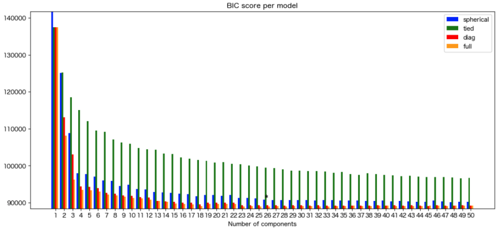
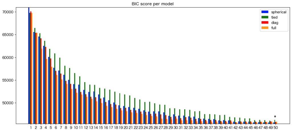
plt.show()GMMによるPCAのモデリングの可視化の結果は以下です。
混合するガウス分布の数は26、共分散はfullがベストであることが分かりました。
PCAを用いるとパスウェイに基づいた化合物は26グループに分けられることが明らかとなりました。
plot_gmm_BICs(bic_results_pca)
GMMによるUMAPのモデリングの可視化の結果は以下です。
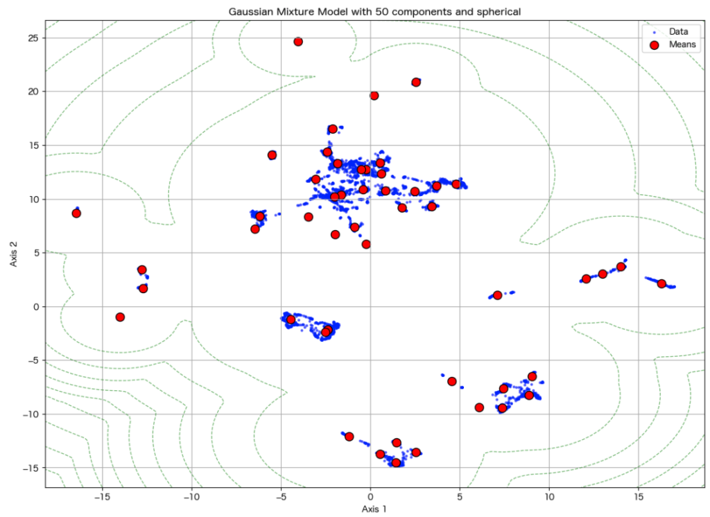
混合するガウス分布の数は50以上、共分散はsphericalがベストであることが分かりました。
UMAPを用いるとパスウェイに基づいた化合物は50以上のグループに分けられることが明らかとなりました。
ただし、50以上の混合数は解釈が困難になるため以降は50をベストとして進めます。
5.3. GMMの可視化
続いて、ベストであったパラメータのGMMによるクラスターの中心と等高線を次元削減した図にマッピングした図を作成してみます。
中心と等高線を描画する関数は以下です。
def plot_decomposition_with_best_gmm(res_decomposition, bic_results):
# to nparray
xy = np.array(res_decomposition.iloc[:, :2])
# unpacking
best_gmm = bic_results['best_gmm']
lowest_bic_n_component = bic_results['lowest_bic_n_component']
lowest_bic_cv_type = bic_results['lowest_bic_cv_type']
# plot decomsition
plt.figure(figsize=(14, 10))
plt.scatter(xy[:, 0], xy[:, 1], s=5, label='Data', color='blue', alpha=0.5)
# plot cluster centers
plt.scatter(best_gmm.means_[:, 0], best_gmm.means_[:, 1], marker='o', s=100, label='Means', color='red', edgecolors='black')
# plot contours
x_min, x_max = min(xy[:,0]), max(xy[:,0])
y_min, y_max = min(xy[:,1]), max(xy[:,1])
x_delta, y_delta = x_max - x_min, y_max - y_min
x = np.linspace(x_min - 0.05 * x_delta, x_max + 0.05 * x_delta, 100)
y = np.linspace(y_min - 0.05 * y_delta, y_max + 0.05 * y_delta, 100)
X_grid, Y_grid = np.meshgrid(x, y)
Z = -best_gmm.score_samples(np.array([X_grid.ravel(), Y_grid.ravel()]).T)
Z = Z.reshape(X_grid.shape)
plt.contour(X_grid, Y_grid, Z, levels=10, linewidths=1, colors='green', linestyles='dashed', alpha=0.5)
plt.xlabel('Axis 1')
plt.ylabel('Axis 2')
plt.title(f'Gaussian Mixture Model with {lowest_bic_n_component} components and {lowest_bic_cv_type}')
plt.legend()
plt.grid(True)
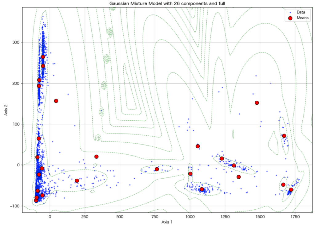
plt.show()PCAの場合、以下のようになります。
plot_decomposition_with_best_gmm(res_pca, bic_results_pca)
UMAPの場合、以下のようになります。
plot_decomposition_with_best_gmm(res_umap, bic_results_umap)
5.4. クラスタリングの可視化
各化合物がどのクラスターに属しているか可視化するため、クラスター毎に色を変えた図も作成してみます。
化合物がどのクラスターに属しているか分かりやすいように、Bokehを用いてHoverによってクラスター番号がポップアップするようにします。
関数は以下となります。
def plot_gmm_clustering(res_decomposition, bic_results, method, no, output='html'):
    # unpacking etc.
    xy = np.array(res_decomposition.iloc[:, :2])
    best_gmm = bic_results['best_gmm']
    clusters = [i + 1 for i in best_gmm.predict(xy)]

    # bokeh libraries
    from bokeh.plotting import output_notebook, figure, show
    from bokeh.io import save
    from bokeh.models import LinearColorMapper

    # dataset
    df = pd.DataFrame(np.hstack([xy, np.array(clusters).reshape(len(xy), 1)]))
    df.index = res_decomposition.index
    df.columns = ['col_0', 'col_1', 'cluster']
    df['InChIKey'] = df.index

    # hover
    tooltips=[
        ('InChIKey', '@InChIKey'),
        ('Cluster No.', '@cluster')
    ]

    # figure
    p = figure(
        width = 750, height = 600, title=f'{method}',
        x_axis_label = 'Axis 1', y_axis_label = 'Axis 2', tooltips=tooltips
    )

    # plot decompositions
    color_mapper = LinearColorMapper(palette='Viridis256', low=min(clusters), high=max(clusters))
    p.scatter(
        x = 'col_0', y = 'col_1',
        source = df,
        color = {'field': 'cluster', 'transform': color_mapper},
        size = 4, alpha = 0.2
    )

    # plot cluster centers
    p.scatter(
        x = best_gmm.means_[:, 0],
        y = best_gmm.means_[:, 1],
        legend_label='Means',
        color = 'red',
        marker="star",
        size = 15, alpha = 0.9
    )

    # output
    if output == 'html':
        os.makedirs(f'{RES_DIR}/bokeh/clustering/{no}', exist_ok=True)
        save(p, filename=f'{RES_DIR}/bokeh/clustering/{no}/decompsition_{method}.html')
    elif output == 'notebook':
        show(p)
PCAの結果は以下です。
no = now()
plot_gmm_clustering(res_pca, bic_results_pca, 'PCA', no, output='notebook')
UMAPの結果は以下です。
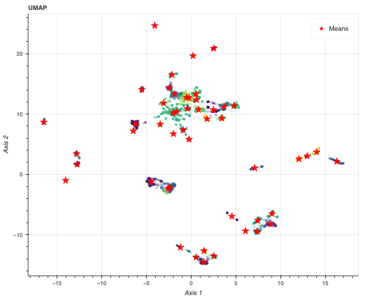
no = now()
plot_gmm_clustering(res_umap, bic_results_umap, 'UMAP', no, output='notebook')
6. まとめ
本記事では、標的パスウェイに基づいて化合物をクラスタリングしました。
以上になります。


コメント